
Creating a clear and compelling homepage message is essential for multi-product companies, especially in the SaaS sector. This task is even more challenging in Japan, where cultural nuances and consumer behaviour significantly impact website engagement and conversion rates. This article explores three main homepage messaging strategies for multi-product companies in Japan: Summarise, Itemise and Prioritise and gives specific strategies for optimising the user experience on a SaaS homepage.
Table of Contents
What is the importance of a clear homepage message for a multi-product SaaS company in Japan?
How can summarising the main value proposition benefit a multi-product SaaS company?
Is itemising individual products effective for Japanese consumers?
What are some tips for optimising a SaaS homepage UX design?
Why is localising content essential for a SaaS homepage in Japan?
Summarise: Creating an All-Encompassing Message
Pros of Summarisation
Unified Brand Image: By summarising, your brand can project a cohesive and sophisticated image, which can be particularly appealing in Japan, where trust and reliability are paramount.
Comprehensive Value Proposition: It showcases the broad capabilities of your company, attracting diverse customer segments.
Cons of Summarisation
Potential Confusion: New visitors unfamiliar with your offerings may find the homepage overwhelming and unclear, which could lead to higher bounce rates.
Japanese Context for Summarisation
In Japan, where consumers highly value clarity and straightforwardness, the summarisation approach must be executed precisely. Companies like Palantir Technologies, Slack, and ServiceNow have successfully implemented this strategy globally, but localisation is key. A clear, concise summary that aligns with Japanese business practices and consumer expectations can mitigate potential confusion.

A Japanese SaaS company like Cybozu, known for its collaborative software, might use a summarisation approach by highlighting its comprehensive solutions on the homepage. However, they should ensure the message is straightforward, perhaps by incorporating familiar business terminologies and success stories from local clients.

Itemise: Detailing Individual Products
Pros of Itemisation
Clarity and Transparency: Prospects can easily understand what you offer and identify the products that meet their needs.
Detailed Insights: You can showcase each product's unique features and benefits.
Cons of Itemisation
Complex Navigation: Visitors might feel overwhelmed by the number of options and find it difficult to pinpoint the right product.
Japanese Context for Itemisation
Japanese consumers appreciate detailed information and transparency. Therefore, the itemisation approach can be highly effective. Companies like Rippling and monday.com exemplify this strategy by providing extensive product details. For the Japanese market, it’s essential to ensure that the navigation is intuitive and that each product description is translated and localised to resonate with local users.

An e-commerce platform like Rakuten could utilise the itemisation approach by showcasing its diverse range of services—from e-commerce to fintech. Each product category should be listed with detailed descriptions, ensuring the content is culturally relevant and in tune with Japanese consumer expectations.

Prioritise: Focusing on Key Products and Segments
Pros of Prioritisation
Higher Conversion Rates: Focusing on your best-fit customers can drive higher engagement and conversions.
Strategic Clarity: Ensures that your homepage aligns with your overall go-to-market strategy.
Cons of Prioritisation
Difficult Decision-Making: Selecting the key product to prioritise can be challenging, especially in a siloed organisation.
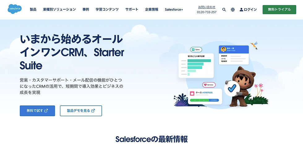
Japanese Context for Prioritisation
In Japan, where the decision-making process is often deliberate and thorough, prioritising can be a powerful strategy. Companies like Salesforce have successfully employed this approach by focusing on their flagship products. For Japanese companies, it’s crucial to prioritise based on local market demands and consumer preferences.
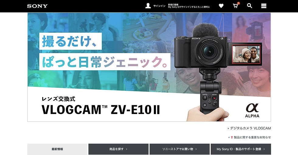
A company like Sony, with its diverse product portfolio, might prioritise its most innovative consumer electronics on the homepage. Highlighting flagship products such as the latest PlayStation or cutting-edge cameras, focusing on their unique features and benefits, can captivate the target audience and drive conversions.
10 Key UX Strategies for Multi-Product Companies in Japan
When applying these homepage messaging strategies in Japan, it’s essential to consider cultural and consumer behaviour nuances. Here are some additional tips to ensure your homepage resonates with Japanese users. When you strip things down to first principles, the user experience on a site consists of two important elements you need to consider: the users, their goals, your goals for them and the website, its design, technology, navigation and content.
1. Make Users Scroll Beyond the Fold
Above the Fold: The area a user sees on the screen without having to scroll down.
Gone are the days when websites used to load slowly owing to super-slow dial-up connections and primitive hosting. Now, websites have become responsive, dynamic, and interactive, with no barriers.
Thus, a homepage that is not beyond a fold is outdated. Having a comprehensive SaaS homepage is now the norm.
The average difference in how users treat info above vs. below the fold is 84%. That’s a good enough reason to focus on the Fold.
Studying page-level data for your site in Google Analytics can give you data points like 8% of visitors scrolling the complete page and 55% scrolling about 25% of the page.
You can also try using tools like ClickTale that create heat maps for your site based on the distribution of users scrolling the page.
How to Induce Scrolling Beyond the Fold:
Include an element that begins above the fold and continues below it. This visual cue can encourage users to scroll down.
Give an explicit pointer to scroll down for more: Arrows or text prompts can guide users to explore further.
2. Zero in on the Footer
Users spend very little time reading the complete copy on the homepage. After looking at your site's header, a user searching for specifics will invariably look at footer links.
In the footer, place links to important landing pages, the sitemap, product information, social media icons, and newsletter subscriptions.
Links in the footer are more critical for a mobile site, as users must scroll back to the top to delve deeper into the site.
The footer also plays an essential but often overlooked part in your homepage's SEO strategy. Well-curated links in the footer can generate a lot of high-intent traffic.
3. Show Visuals of Your Product
There is little chance you and I would buy something we haven’t seen. Your homepage should ideally include a sneak peek that provides an overview of critical aspects of your product.
Give users a glimpse into what your product looks like on the homepage. It sets a tone as to what exactly your product will be like.
Determine the right place for placing images using heat maps. Heatmaps provide a visual overview of where users click, helping you understand user behaviour on your site. They are a source of invaluable insights about how users behave and where they click on your site.
4. Be Accessible to Users
There are those customers who do not want to wait for your call. They want instant answers to queries.
Do away with inherent complexity in the design of the homepage and make contact information readily accessible (preferably in the footer).
Secondly, third-party tools should be used to enable live chat with users on the site. Live chat as an instant query redressal mechanism also works wonders for lead generation.
You will have to invest in dedicated human resources to handle chat requests. The same goes for displaying helpline or customer support numbers on the homepage.
5. Use CTA that Encourages Action
The homepage or a part of the homepage should logically conclude with a CTA, meaning that the user should cognitively perceive CTA as something to act upon. As if to click on it is the next obvious step.
Placing a CTA is essential, as are other design, colour, and copy elements. A simple change in CTA copy can lead to significantly better results.
Benefit + Relevance = Better Click-Throughs
Here, the benefit in the CTA copy concerns what the user will get after clicking, and relevance concerns the context of the CTA placement.
Remember what they say about practice, and use the same mantra to optimise your CTA—test, test, and test again. Use data from the Events section in GA to get click-through rates of all CTA buttons on the homepage. Run A/B tests to figure out the combination that works best for you.
6. Explanatory Video for Your Product/Business
Video as a medium makes content easily absorbable, increasing the chances of users getting hooked to the website and, thus, the product.
Videos are processed by the brain 60,000 times faster than text.
A short 30-second or a minute-long video introducing your business to the world is a must.
Videos work exceptionally well for SaaS companies. Illustrative videos explaining the process of using your product, how you help your customers, simplify the inherent complexity for users in understanding SaaS products.
Include a call to action at the end of the video for signup or a logical call to action that takes users to the next step. The click-throughs of the CTA also allow you to measure the effectiveness of the video.
7. Demonstrate How Your Product Works
The choice largely depends on the type of customers your business caters to: enterprises or SMBs. Enterprise clientele expects high-touch human-aided demos and real-world case studies, whereas SMBs are content with DIY, free trials. Either way, make the demo immersive, involve your customer, and make it relevant.
To optimise the demo elements on the homepage, you need to test the placement of the demo's CTA and the copy in and around it. Conduct A/B tests to determine the best combination for maximum engagement and conversions.
8. Express in One Line the Value You Deliver
On the homepage, on the fold, that one crucial line in bold that expresses your business to the world is the Value Proposition.
The statement summarises why a prospect should buy your product or use your service.
The attention span of humans (abysmal at 8 seconds) is less than that of the proverbial goldfish. Therefore, write a Value Proposition that is succinct, distinct, memorable, and desirable. It should clearly articulate what benefits you bring to users.
Duration of Visit is one metric that usually points towards lapses in the Value Proposition. For example, if 70% of visitors have a Duration of Visit of 0-10 seconds, it possibly indicates that the one line defining your business is not compelling enough.
9. Build Trust Through Testimonials and Client Logos
Groove found that good testimonials increase conversions by up to 15% on their homepage. Showcasing a list of esteemed clientele or testimonials praising your product builds trust.
Often, there’s a need to optimise the placement of these trust-building elements on the homepage. You can start with understanding user behaviour on your site with session recording tools. These tools allow you to playback everything your site visitors do, as if watching over their actions sitting next to them. Tools like Inspectlet and Usabilitytools help businesses understand user behaviour via session recording.
10. Outstanding Website Content
“Content is King.” The ultimate factor that will make a user scroll through the entire website is the content. If it goes wrong, it will lead to a bounce; if it clicks with the reader, it will lead to a conversion. Showcase your authority and domain expertise with links to the resource section of your site. You can also show snippets of whitepapers and case studies to demonstrate your expertise.
Mastering homepage messaging for multi-product companies in Japan requires a strategic approach that balances clarity, comprehensiveness, and localisation. Whether you summarise, itemise, or prioritise, tailoring your message to Japanese consumers' unique preferences and expectations is essential. By localising your content, highlighting trust indicators, optimising for mobile, emphasising customer support, and using data-driven insights, you can create a compelling homepage that effectively engages and converts your target audience in Japan.
Incorporating these strategies will enhance your brand’s visibility and reputation and drive higher engagement and conversions in the competitive Japanese market. By focusing on the unique aspects of Japanese consumer behaviour and cultural nuances, you can create a homepage that resonates with your audience and supports your business goals.
FAQ Section
What is the importance of a clear homepage message for a multi-product SaaS company in Japan?
A clear homepage message is crucial for multi-product SaaS companies in Japan, as it is the first impression and primary gateway for potential customers. It helps convey the main value proposition, builds trust, and addresses cultural nuances and consumer behaviour specific to the Japanese market, which can significantly impact engagement and conversion rates.
How can summarising the main value proposition benefit a multi-product SaaS company?
Summarising the main value proposition can benefit a multi-product SaaS company by projecting a unified and sophisticated brand image. This approach showcases the company's broad capabilities, attracting diverse customer segments. It is particularly effective in Japan, where consumers value trust and reliability.
Is itemising individual products effective for Japanese consumers?
Itemising individual products is effective for Japanese consumers because they appreciate detailed information and transparency. By listing and describing each product clearly, companies can help potential customers navigate their offerings more easily, making finding products that meet their needs more straightforward.
What are some tips for optimising a SaaS homepage UX design?
Some tips for optimising a SaaS homepage UX design include:
Encouraging users to scroll beyond the fold.
Enhancing the footer with essential links.
Showcasing product visuals.
Making contact information easily accessible.
Using compelling calls-to-action (CTAs).
Incorporating explanatory videos.
Demonstrating how the product works.
Clearly stating the value proposition.
Building trust through testimonials and client logos.
Ensuring outstanding website content.
Why is localising content essential for a SaaS homepage in Japan?
Localising content is essential for a SaaS homepage in Japan to align with local business practices, consumer expectations, and cultural nuances. It ensures the messaging resonates with the target audience, improving engagement and conversion rates by making the content more relevant and understandable to Japanese users.
Ready to learn how to launch, integrate, and scale your business in Japan?
Download our intro deck and contact ULPA today to understand how we will help your company learn the rules of business in Japan, and then redefine those rules.
Let The Adventure Begin.
Comments