Beyond Translation: Japanese Typography in Web Design
- ulpa

- Apr 23, 2024
- 5 min read
Updated: Jun 10, 2024

"Web Design is 95% Typography". This quote from Oliver Reichenstein, is even more pronounced during phases when minimalist designs gain traction. Such periods emphasise the elegance and clarity of typography, casting aside superfluous elements in favour of crisp textual presentation. When localising web content for different cultures, the task extends beyond mere linguistic translation. The essence lies in discerning and adopting the myriad design intricacies that are deeply embedded in the historical and cultural fabric of each language.
一: The Art of Japanese Typography in Web Design
Japanese typography, with its rich tapestry of characters and symbols, stands as a testament to this complexity. Take, for instance, the kanji character "艦" (kan), which, due to its intricate structure, necessitates considerably more space for legibility compared to the relatively straightforward English letter "A". This isn't just a quirk of the script but a reflection of Japan's design philosophy.

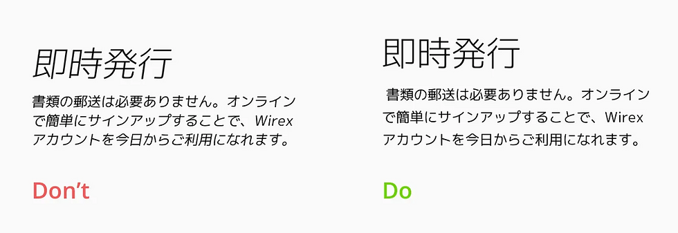
Experts, such as Brandon Hill, emphasise that Japanese web design often leans towards information-dense layouts, a nod to the local users' penchant for detailed information and a systematic decision-making process. Such a design preference places significant emphasis on ensuring that text is both legible and aesthetically pleasing, a balance that can be challenging to strike. Hayataki Masaharu, a proponent of web design best practices in Japan, in a recent LinkedIn article, underscored the need for larger font sizes, precise letter spacing, and generous line heights explicitly tailored to cater to the unique requirements of different font families. The quirks of the Japanese language further compound these design considerations. For one, the language doesn't routinely employ spaces between words, resulting in a contiguous and consistent visual flow of text. This consistency presents both a challenge and an opportunity for designers. The challenge takes the form of what I like to call "line break hell" for designers who must create graphical assets but don't read or write Japanese, and for those designers who do read and write Japanese, an opportunity because it demands judicious text alignment to ensure an appealing presentation. In Japan, the consensus leans towards justified text alignment, yielding a harmonised visual balance. Additionally, when delving into the specifics of text presentation, Japanese design considerations vary from their English counterparts. Line lengths, for instance, are tailored to the medium of presentation, whether a desktop, mobile device or print, ensuring optimal readability and visual appeal across all platforms.
二:Understanding Japanese Font Styles: Mincho vs. Gothic

In the vast world of typography, distinctions often arise based on cultural and historical nuances. While Western design paradigms traditionally bifurcate fonts into Serif and Sans-Serif, Japan approaches this distinction with a more storied perspective, naming them “Mincho” for Serif and “Gothic” for Sans-Serif. The historical tapestry behind these categorisations is rich and multifaceted. Mincho, for instance, harks back to the era of the Ming Dynasty. Its design intricacies, replete with ornamental flourishes and line variations, encapsulate centuries of artistic evolution and cultural inclinations. Gothic, on the other hand, embodies a more contemporary aesthetic, its emergence coinciding with the post-war era in Japan when a wave of modernism began to influence many facets of design and society. This style is characterised by its streamlined appearance, eschewing decorative elements in favour of a sleek, consistent line thickness that resonates with modern sensibilities.
Each font category carves out a unique niche within the design spectrum.
However, the panorama of Japanese typography is wider than just Mincho and Gothic. It’s a vibrant mosaic encompassing myriad styles such as Sosho – a cursive representation reminiscent of traditional brush strokes, and Kaisho – which exudes a more formal and structured vibe. Each font category carves out a unique niche within the design spectrum. For example, while Mincho and Gothic are the stalwarts in realms like desktop publishing and graphic design, serving as the bedrock for most web interfaces and printed collateral, other font styles, like Sosho or Kaisho, might find their calling in calligraphy, artful representations, or specialised content forms. The font choice isn't a trivial matter; it’s an intricate dance of aesthetics, purpose, and cultural resonance.
The Japanese populace, historically accustomed to meticulously guided experiences, often places immense trust in printed content. This affinity for authenticity and structure cascades into their digital experiences as well. Therefore, selecting the right font becomes a mission to bridge tradition with modernity. It's not merely about aesthetics but about communicating in a language that aligns with cultural predilections, historical reverence, and contemporary trends. In essence, while one font might evoke nostalgia and trust among an older demographic, another might resonate with the dynamism and aspirations of the younger generation. Choosing the perfect font in Japanese design is akin to orchestrating a symphony, harmonising the notes of history, culture, and intent.
三:The Intricacies and Solutions in Web Typograph
Japanese web localisation is a multifaceted endeavour that extends beyond mere linguistic adaptation. At its core lies the intricate world of design nuances, particularly in typography, which presents unique challenges distinct from its English counterparts. The absence of elements like the x-height demands precision. Japanese design consistently exhibits a mix of reverence for time-honoured principles and modern aesthetics, a blend not commonly seen in the West's evolutionary design trajectories. These nuances, from the overarching design philosophy to the nitty-gritty details, necessitate a profound comprehension of the Japanese typographical landscape. Delving deeper, the significance of font 'pitch', be it “proportional” for dynamic interfaces or “fixed” for structured content, emerges as pivotal in ensuring content harmony and reader engagement.
These nuances, from the overarching design philosophy to the nitty-gritty details, necessitate a profound comprehension of the Japanese typographical landscape.
Beyond these design intricacies, localising for the Japanese web is a journey into the nation's cultural heart. Insights from discussions, as the Disrupting Japan podcast mentions, unveil the layers of Japanese societal norms, including the meticulous decision-making within organisations and the esteemed place designers hold. These cultural underpinnings play a vital role in shaping digital consumption in Japan, with elements like consensus-driven decision-making or high regard for design sophistication providing valuable context. To succeed in this landscape, one must craft more than a localised web experience; it requires a harmonised digital narrative resonating deeply with Japan's rich cultural tapestry, offering users an experience that feels genuine and familiar.
Japanese web design transcends mere typography, weaving history and modern sensibilities into a unique tapestry. Through Kanji intricacies and storied fonts like Mincho and Gothic, the essence of Japanese digital artistry emerges. To flourish in this space, designers must adapt and resonate, creating narratives that echo Japan's rich cultural heritage while embracing contemporary trends.
Ready to learn how to launch, integrate and scale your business in Japan?
Download our intro deck and contact ULPA today to understand how we will help your company learn the rules of business in Japan, and then redefine those rules.
Let The Adventure Begin.
Comments